Comparison
简单对比图
一般出现在混合图表中。混合图表里的两个图一般都是分开描述,如果有一些内在的联系,只需要在结尾段点出来就好了。
复杂对比图
文体结构
1.Introduction:改写题目
2.Overall:概括数据2-3个宏观规律
3.数据分组介绍1
4.数据分组介绍2
For example
Task 1: The pie charts below compare water usage in San Diego, California and the rest of the world.
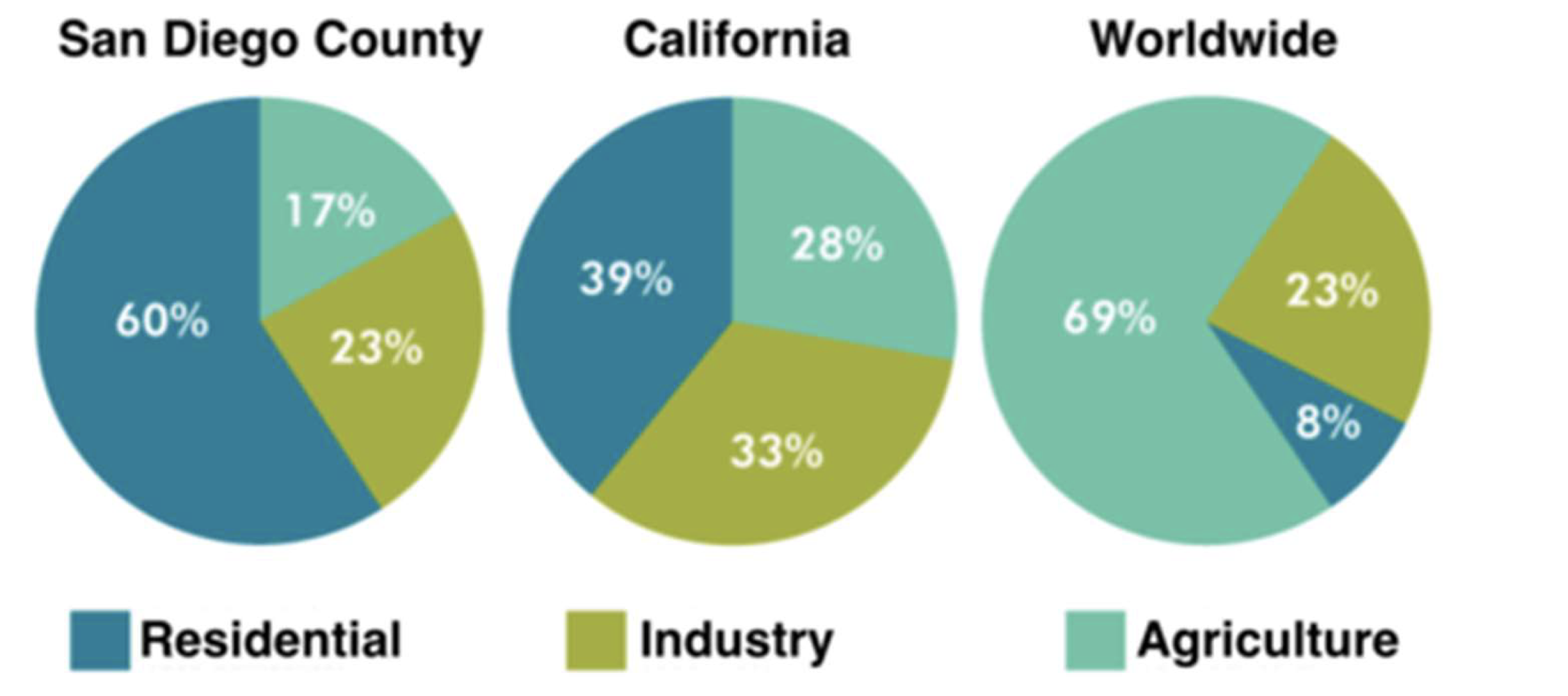
Introduction:改写题目
The pie charts give information about the water used for residential, industrial and agricultural purposes in San Diego County, California, and the world as a whole.
Overall:数据的宏观规律:美国两个地区家庭用水量最大。相反,世界范围来看,农业用水占比最多。
It is noticeable that more water is consumed by homes than by industry or agriculture in the two American regions. By contrast, agriculture accounts for the vast majority of water used worldwide.
Body Paragraph 1 - 数据分组介绍1:San Diego, California地区用水类型跟全世界范围中差距较大的部分。
In San Diego County and California State, residential water consumption accounts for 60% and 39% of total water usage. By contrast, a mere 8% of the water used globally goes to homes. The opposite trend can be seen when we look at water consumption for agriculture. This accounts for a massive 69% of global water use, but only 17% and 28% of water usage in San Diego and California respectively.
Body Paragraph 2 - 数据分组介绍2:San Diego, California地区与全世界范围用水量差距不大的部分。
Such dramatic differences are not seen when we compare the figures for industrial water use. The same proportion of water (23%) is used by industry in San Diego and worldwide, while the figure for California is 10% higher, at 33%.